How Responsive Design Transforms Websites in Webflow
In today’s digital age, users access websites from a multitude of devices – from smartphones and tablets to desktop computers and everything in between. As such, creating a seamless and enjoyable browsing experience across different screen sizes and devices is crucial for the success of any website. Enter Webflow, a powerful platform that empowers designers to create responsive websites with ease. In this article, we’ll explore the principles of responsive design in Webflow, uncovering its features, benefits, and how it transforms the way we build websites.
Understanding Responsive Design in Webflow
Responsive design is a design approach that ensures a website’s layout and content adapt fluidly to the screen size and device used by the visitor. In Webflow, responsive design is at the core of the platform’s ethos, allowing designers to create websites that look great and perform flawlessly on any device.
Key Features of Responsive Design in Webflow
Flexible Layouts
In Webflow, designers can create flexible layouts using a combination of containers, grids, and flexbox. These layout tools enable designers to create fluid and adaptive designs that adjust dynamically based on the size of the viewport.
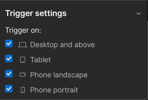
Breakpoints
Webflow allows designers to define breakpoints – specific screen widths at which the layout of the website changes to accommodate different devices. By setting breakpoints and adjusting the layout accordingly, designers can ensure that their websites look and function optimally across various screen sizes.
Customizable Styling
With Webflow’s powerful styling options, designers can customise the appearance of their websites for different screen sizes. From typography and colours to spacing and alignment, designers have granular control over every aspect of the design, ensuring consistency across devices.
Interactions and Animations
Webflow’s interaction and animation features are fully responsive, allowing designers to create engaging and interactive experiences that work seamlessly on any device. Whether it’s a subtle hover effect or a complex scroll-triggered animation, designers can bring their designs to life while maintaining responsiveness.
Benefits of Responsive Design in Webflow
Improved User Experience
Responsive design ensures that users can access and navigate your website easily, regardless of the device they’re using. By providing a consistent and intuitive browsing experience, responsive websites in Webflow can reduce bounce rates and increase user engagement.
Expanded Reach
With the proliferation of mobile devices, responsive design is essential for reaching a wider audience. By optimising your website for mobile devices, you can tap into the growing number of users who access the internet on smartphones and tablets.
SEO-Friendly
Responsive design is favoured by search engines like Google, as it allows them to crawl and index your website more effectively. By providing a consistent URL and HTML code across all devices, responsive websites in Webflow can improve your search engine rankings and drive more organic traffic to your site.
Future-Proofing
With responsive design, your website is prepared for the future of the web. As new devices with different screen sizes and resolutions emerge, your website will adapt gracefully, ensuring a seamless experience for users regardless of the technology they’re using.
Conclusion
In conclusion, responsive design is essential for creating websites that look great and perform flawlessly across all devices. In Webflow, responsive design is not only achievable but also intuitive and accessible to designers of all skill levels. By leveraging Webflow’s flexible layouts, customizable styling options, and responsive features, designers can create websites that provide a seamless and enjoyable browsing experience for users, regardless of the device they’re using. So why wait? Dive into responsive design in Webflow today and elevate your web design game to new heights.
Read More : How Responsive Design Transforms Websites in Webflow


Comments
Post a Comment